An accessible design system, designed in code
I built a fintech's component library from scratch on MUI and Material 3, then moved design out of Figma and into code, where Storybook became the design surface.
- Role
- Lead designer and builder
- Team
- Design team and product engineers
- Timeline
- 2022 – present
- Tools
- Figma (2022–25), Storybook, MUI, Material 3, Claude Code
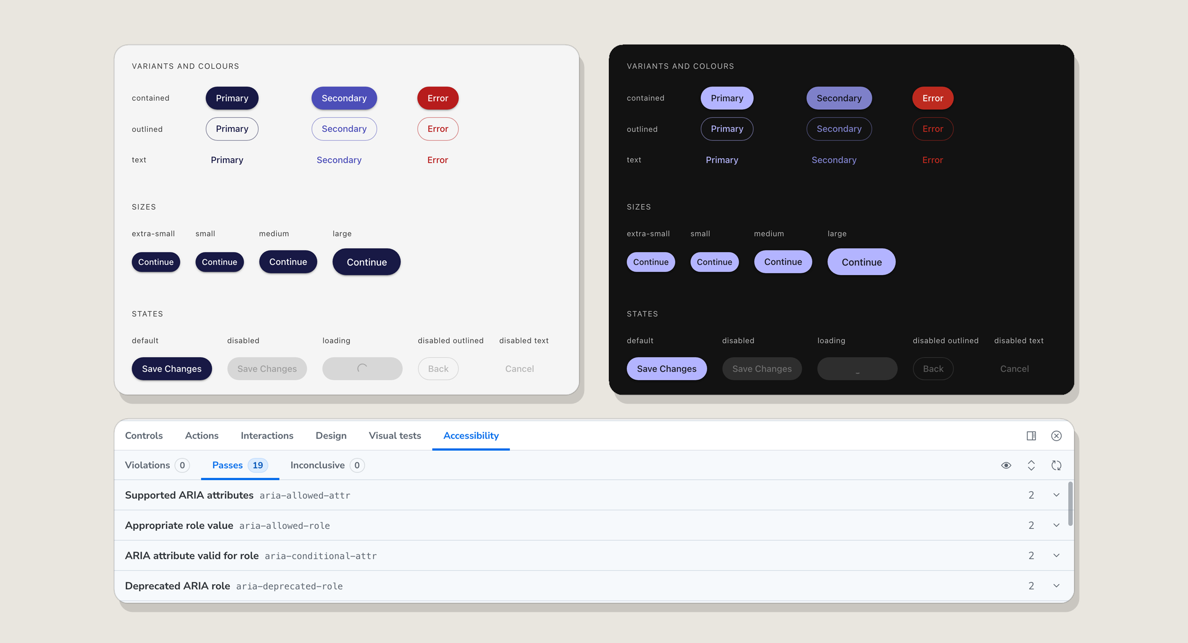
OutcomeMore than 100 components, all built and documented, with about half of the app now running on them. A Claude Code workflow I designed lets anyone on the team create, review and migrate UI to the same standard.
The problem
As the product grew from early stage to Series A, every feature solved UI problems its own way. The same component existed in several versions, handoff needed constant clarification, and accessibility depended on who built the screen.
The team needed one source of truth that designers and engineers both trusted, and that made the accessible choice the easy one.
Results so far
Starting in Figma
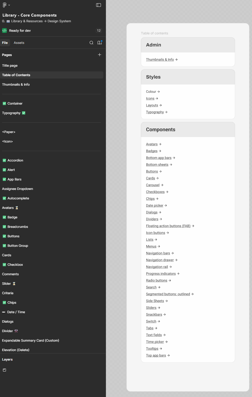
In 2022 I began by auditing the product for repeated patterns and inconsistencies, then defined styles and components in a Figma library: colour, type, layout and more than 30 components, each marked when ready for development.
For three years Figma gave the team a shared language. But every decision lived in two places, the design file and the code, and the two kept drifting apart.
Moving design into code
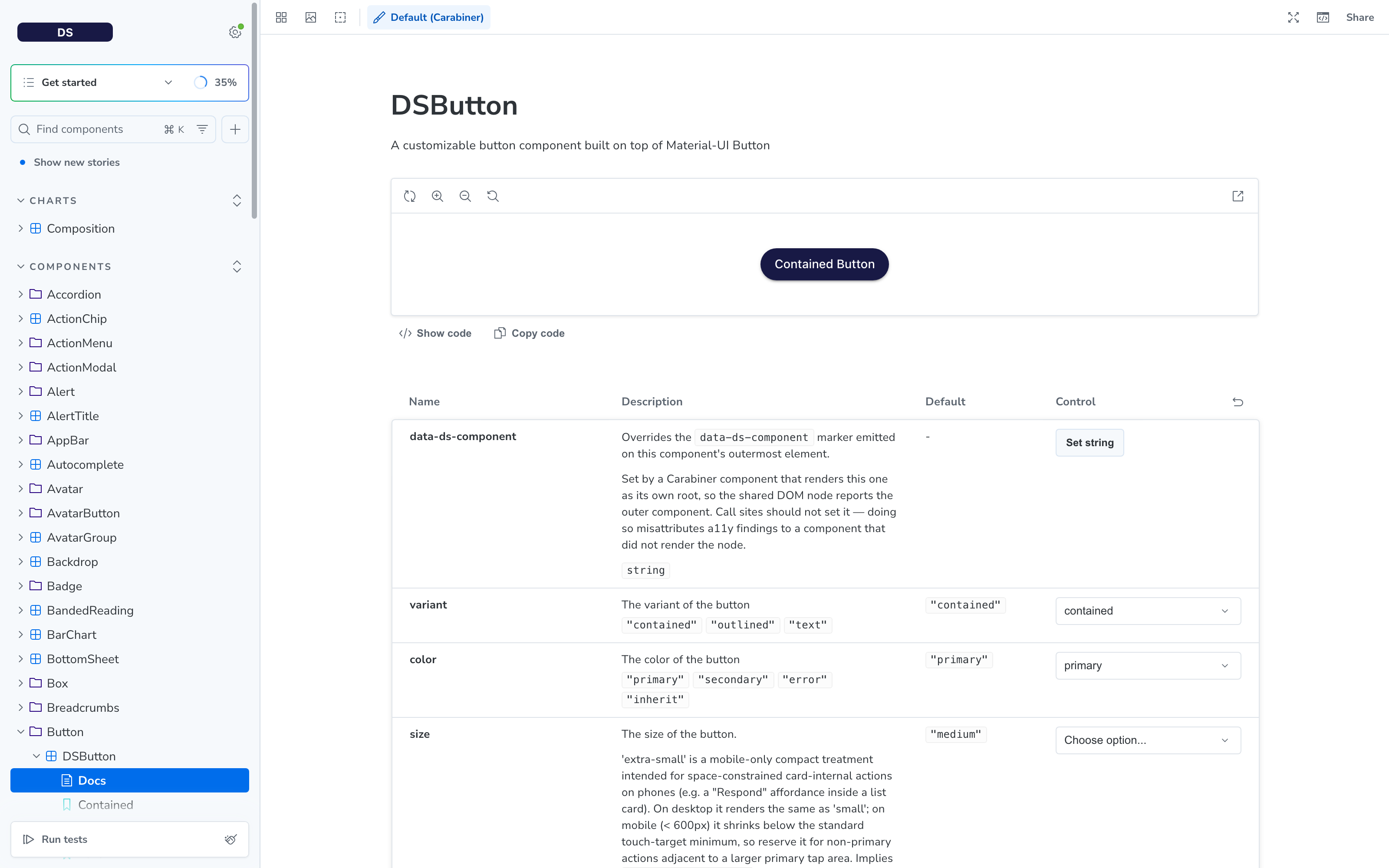
At the end of 2025 I started working in Claude Code, and around Christmas we moved the system into code. From then on Figma became redundant. I now design directly in the component library, making decisions in React and reviewing them in Storybook, where every variant and state is live.
The library wraps MUI React primitives and follows one principle:
MUI tells us what we can do. Material 3 tells us what we should do. Where MUI allows something Material 3 discourages, we follow Material 3 and document the deviation. Where the brand needs something different, the customisation is deliberate and written down.
Designing in code removed the handoff step. What I review in Storybook is exactly what ships.
Teaching AI the system
I designed the team's Claude Code workflow for the design system, so the rules live where the work happens:
- Create: a command scaffolds a new component from an MUI primitive. It reads existing components first, proposes an API for approval, builds it, and writes its usage and accessibility docs.
- Review: commands audit a component against Material 3, WCAG 2.1 AA, MUI compatibility and responsiveness, and check that components are used as intended. Every finding names a file, a line and a fix a junior engineer can act on.
- Plan: a page audit lists every component a screen uses, sorts it into what already exists, what stays in the app and what to build, and outputs a ready-to-paste Jira ticket.
- Execute: a ticket runner walks that Jira ticket subtask by subtask, calling the right command for each and stopping for approval after every step.
- Coach: an agent pairs with junior engineers as they build components, explaining each decision against our precedent and the Material 3 rules.
The result is a system that scales beyond me: anyone, human or AI, building UI gets the same standards by default.
Accessibility built in
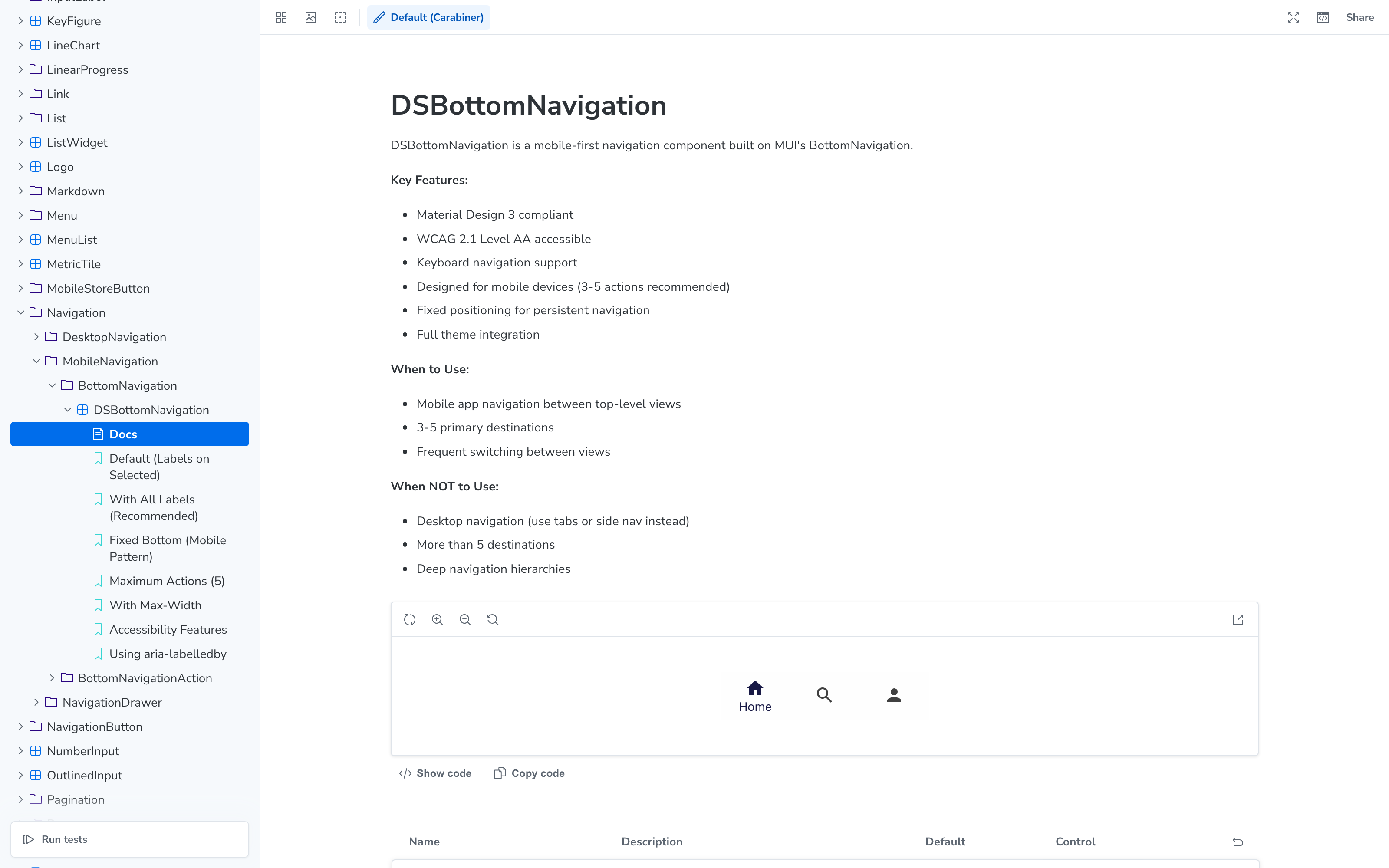
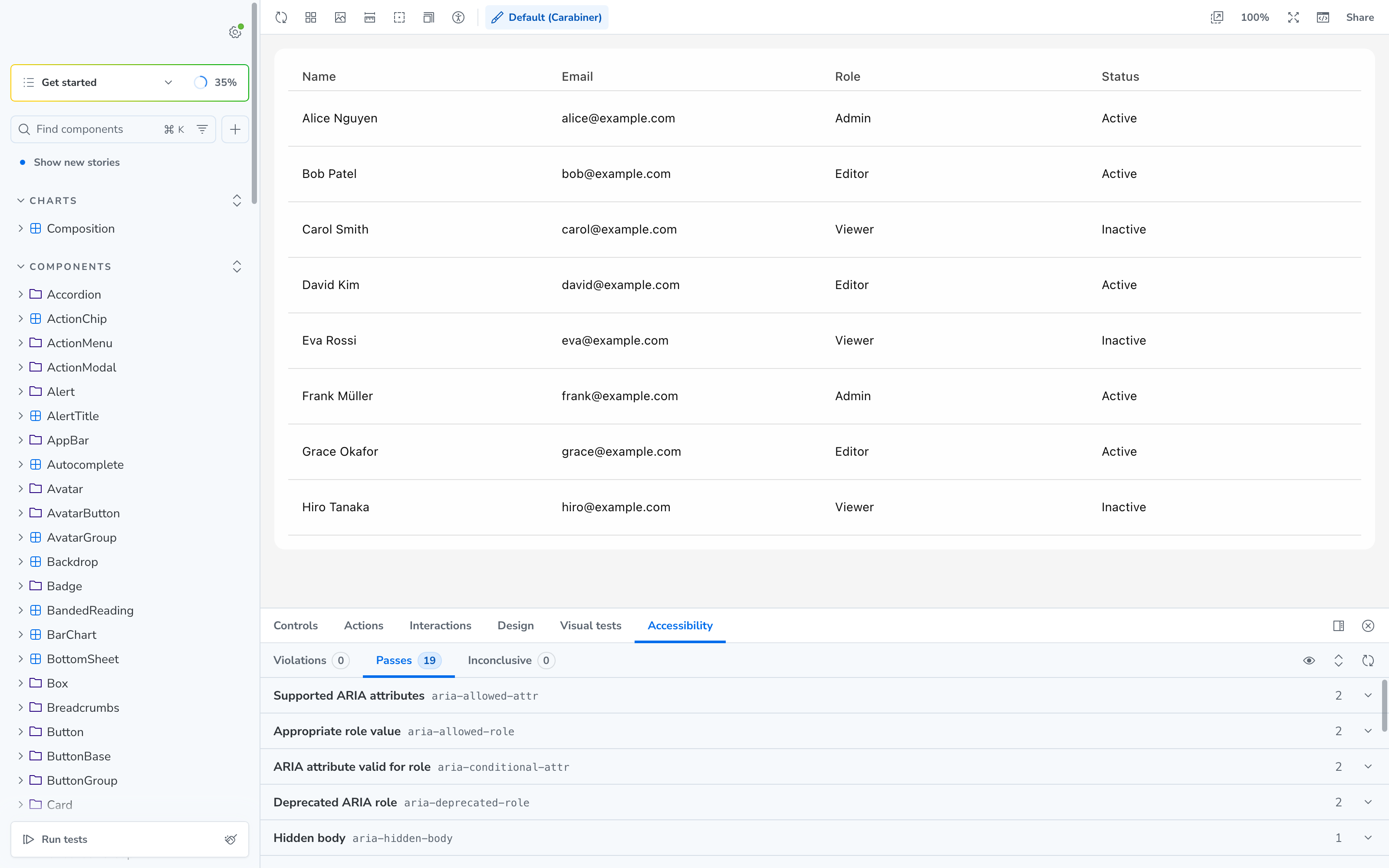
Every component is designed and built to meet WCAG 2.1 AA and ships with an accessibility compliance doc covering keyboard use, focus, contrast and ARIA. Components also warn in development when they're used in a way that would hurt accessibility.
// Runtime check inside the button component
if (label === label.toUpperCase() && label.length > 2) {
  console.warn('Button: label must not be all caps. Use title or sentence case.');
}
On top of that, an automated sweep checks all 1,313 Storybook stories against WCAG 2.1 AA every weeknight, so regressions are caught across the whole library, not one component at a time.
Building the rules into the components means accessibility no longer depends on every engineer remembering them.
Theming: dark mode and skins
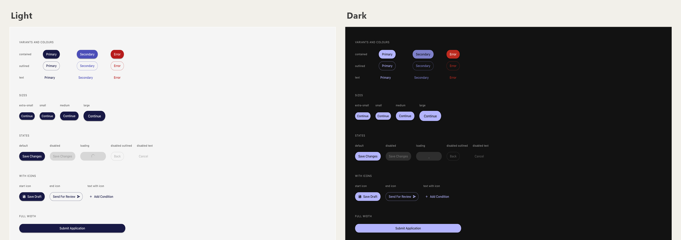
The theme had a basic dark palette from the start, but it wasn't reliable: colours read in code resolved to their light values, and pieces of the app went invisible in dark mode. Our own team, most of whom work in dark mode, had asked for it for a long time.
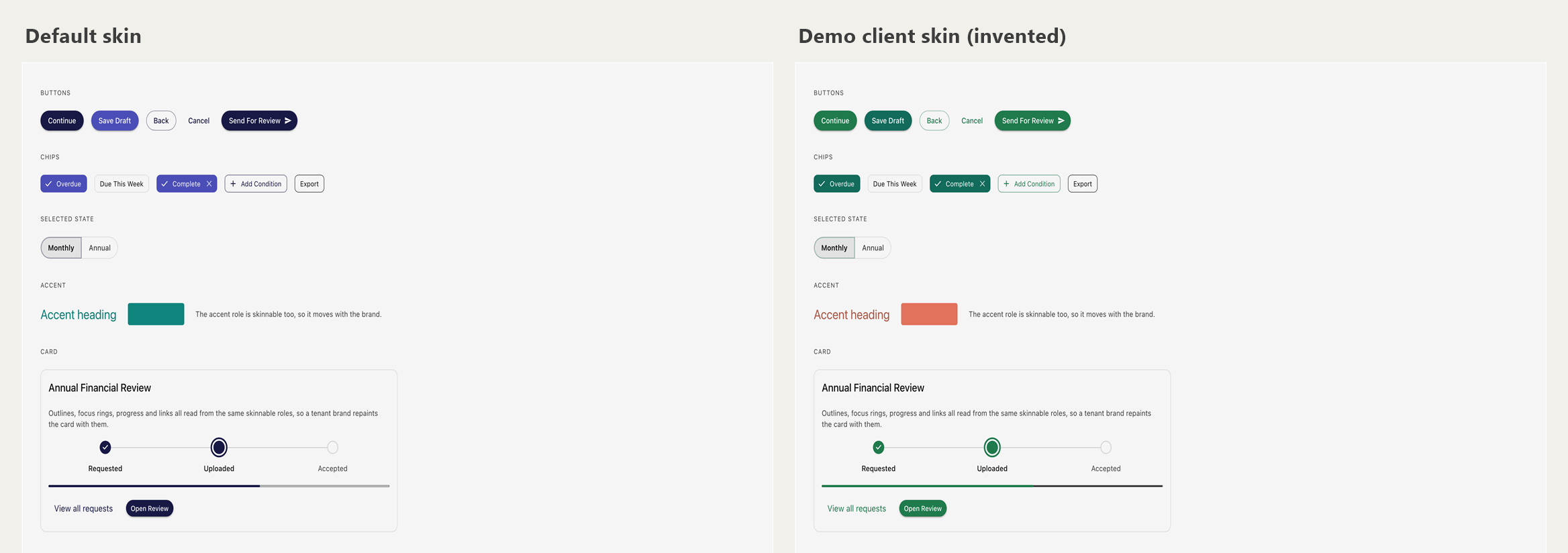
From July 2026 I led a restructure of the colour theme. It has grown from 35 colour roles to 42, with new roles for things one colour can't do safely, like an accent that works as a fill but needs a separate, darker shade as text. Many values are now derived and measured when the theme builds, rather than picked by hand.
On the same structure I designed and built, with Claude, a skin system for white-labelling. A lender can have the platform in their own brand colours, but only primary, secondary and accent can change. Everything that carries a contrast guarantee stays governed by the system, so a brand can't break accessibility.
Skins carry regional formatting too, such as day-first dates (9 Mar 2026) or month-first (Mar 9, 2026), which matters when the same product serves lenders in the UK and the US.
In September 2026 I made dark mode a user choice: Light, Dark or Use Device Setting, applied instantly with no flash of the wrong theme. I wrote 80% of the dark mode work.
Contrast is checked in both schemes by scripts that read the real theme. Five of the bugs they caught failed in only one scheme, and two of those failed in light mode, which is why every check measures both.
The migration
With the library complete, I'm leading the move of the live app onto it. About half of the app is migrated so far.
The migration isn't a straight swap. I audit each page's UI and UX as I go and propose a redesign where it's needed, so every migrated screen comes out more consistent and easier for lenders and borrowers to use, not just rebuilt with new parts.
Every component I redesign is also responsive. The platform was built for desktop only, but most borrowers use their phones, so each migrated screen becomes mobile-friendly with only small adjustments.
Owning UI quality across the team
I review every pull request that touches UI, from every developer on the team. It's a role built on trust: nothing reaches users until I've checked it.
- Does it use the right design system components?
- Does it follow our usage and accessibility guidelines?
- Is it consistent with the rest of the platform?
- Is it good UX for the people using it?
My own pull requests go through an AI code reviewer and, where needed, a developer. The Claude Code commands above mean most issues are caught before a PR reaches me, so reviews focus on experience, not fixing basics.
What the team says
“Rachel built our design system and the tooling around it, so developers get her standards by default. She reviews every UI change we ship, and she turns concepts into working front end in a day.”
Libby, lead developer
What I learned
Designing in code was the biggest shift. It cut out a whole layer of drift between design and build, and it made AI genuinely useful: Claude Code can follow a system written in code far more reliably than one described in a design file.