From mistrust to one source of truth
I designed the first version of our loan review tools in 2024. In 2026 a US client still didn't trust them with their work, so I sat in on research sessions with their team, then designed and built the front end of the fixes.
- Role
- Lead designer: v1 in Figma, fixes built in code
- Team
- Product, engineering and the client's servicing team
- Timeline
- Nov 2024 (v1); June 2026 – present
- Tools
- Figma, remote research, Claude Code, design system
OutcomeNine pain points turned into a six-part roadmap. I've designed and built the first three fixes, with the fourth under way. A developer handled the back end.
Where it started
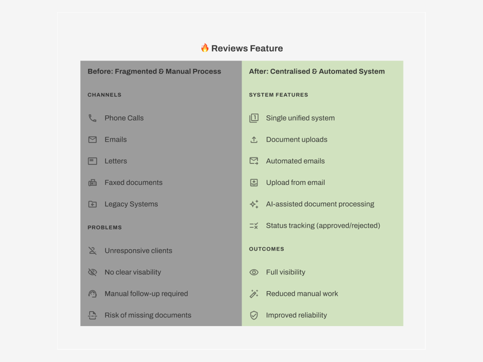
Lenders used to chase borrowers for review documents through email, letters, phone calls and fax. Nothing was tracked, statuses were unclear, and legally required paperwork could slip through.
As lead designer, I wrote the spec with product and development, then designed version one in Figma for both sides: lenders setting up and managing reviews, and borrowers seeing what was needed and uploading it. It launched in November 2024.
Three versions, one choice
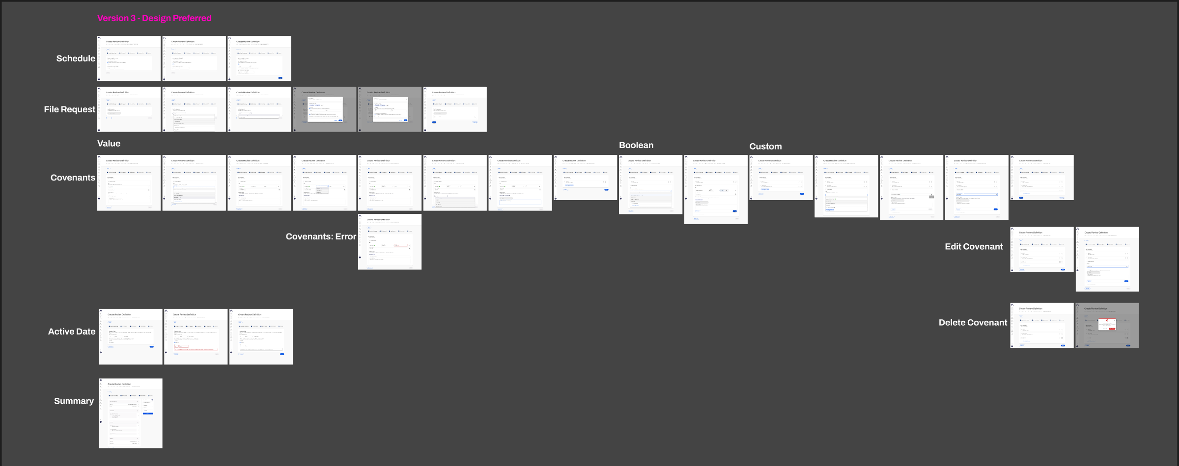
I explored three versions of the review setup flow, mapping every state: schedule, file requests, covenants of three types (value, yes/no and custom), errors, editing, deleting and a final summary. Comparing them with product and development is how we chose the preferred design. The flow launched with three steps and grew to five by mid-2025 as needs became clear.
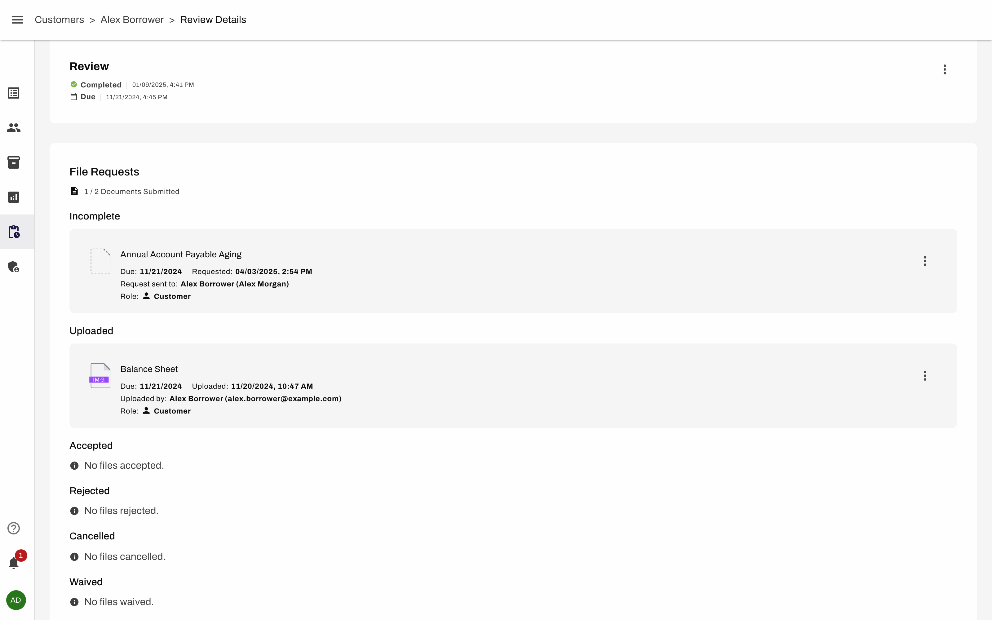
Every document request shows its status at a glance (incomplete, uploaded, accepted, rejected, cancelled or waived), and automated reminders replace manual chasing. When a borrower uploads a file, AI checks it and flags it if it may not be the document that was requested. I advised the junior developer who built that on how a lender would want it to behave.
Version one worked: it replaced five channels with one. But shipping wasn't the end of the story.
Context
By 2026, one of our clients, a US lender, was using the platform to manage loan reviews, but usage was low and the team sensed something was off.
Rather than guess, we ran three remote sessions over Google Meet in June and July 2026 and watched their servicing team do their real work. The rule we set ourselves: absorb, don't fix on the call. Come back with design concepts instead.
How we ran it
- Session 1: staff walked us through how they find and work on reviews day to day.
- Session 2: a deeper look at how they configure reviews, add requirements and enter covenants.
- Session 3: how new loans are onboarded and set up for their first review.
I observed every session, noting where people hesitated, worked around the product, or went to another tool. Between sessions, staff logged frustrations and screenshots as they hit them.
What we saw
No source of truth
Staff ran their real work in a project board, a file store and their core banking system, then updated our product afterwards. It felt like extra admin, not the place work happens.
Navigation felt fuzzy
Users clicked around in loops and weren't confident they were seeing the full picture, especially when a customer had several reviews open at once.
The wrong mental model
We organised work by product and review. They think about the member, and only care whether they have the documents they need.
Dates they couldn't trust
Review dates came from loan anniversaries, but staff work to the dates documents are actually due. The mismatch eroded trust in everything else.
Fear of spamming borrowers
Nobody could see that duplicate requests were merged, so staff worried about asking a borrower for the same document twice.
The root problem wasn't a missing feature. It was trust. The goal everyone agreed on: a single, confident snapshot of what's required, what's received and what's missing, without cross-checking other systems.
From findings to a roadmap
We distilled the sessions into nine issues, then mapped each one to the change that would solve it. Some fixes solve several issues at once, which set the order.
| Fix | Solves | Status |
|---|---|---|
| Reviews OverviewDesigned and built by me | Clunky reviews, several open at once, hard to find the right one | Built |
| Requests OverviewDesigned and built by me | They care about documents, not reviews; member-centric view | Built |
| Request deduplicationDesigned and built by me | Fear of spamming borrowers; lost trust | Built |
| Request rejectionDesigned and built by me | Cancelled requests treated as throwaway, not a conversation | In progress |
| Reviews and requests refactor | Reviews own document requests; statuses differ across the app | Planned |
| Due dates fix | Dates don't match their other systems | Needs client decision |
What I designed and built
Reviews Overview
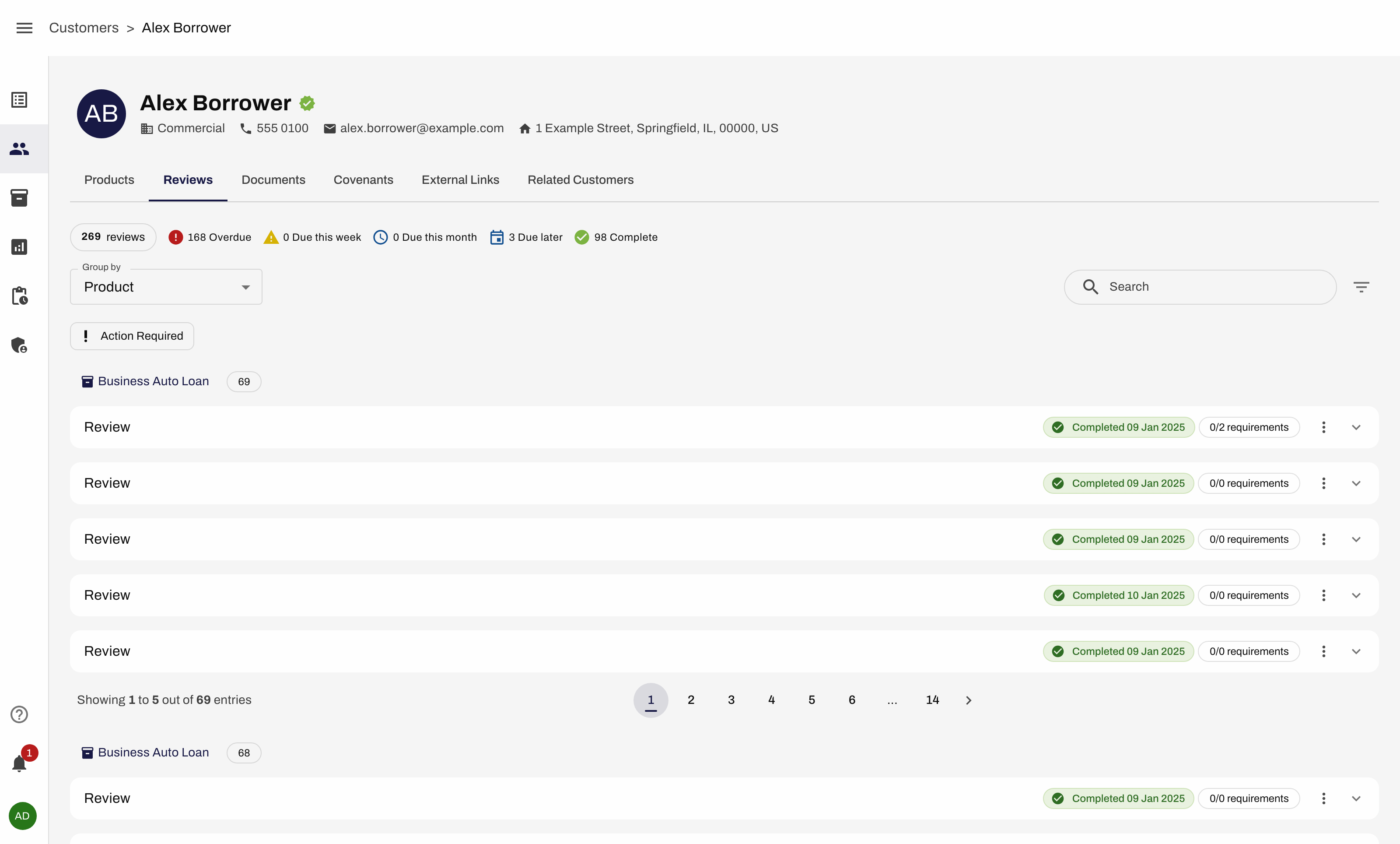
One tab on the member profile that shows every review and its status at once, with totals for overdue, due soon and complete, grouped by product. It replaces drilling in and out of individual reviews to find a single item.
Requests Overview
A Documents tab that shows every document requested from a member in one place, grouped by document type, with totals for overdue and due soon and a clear status on each. Staff can check they have what they need without thinking about reviews at all, which is how they actually work.
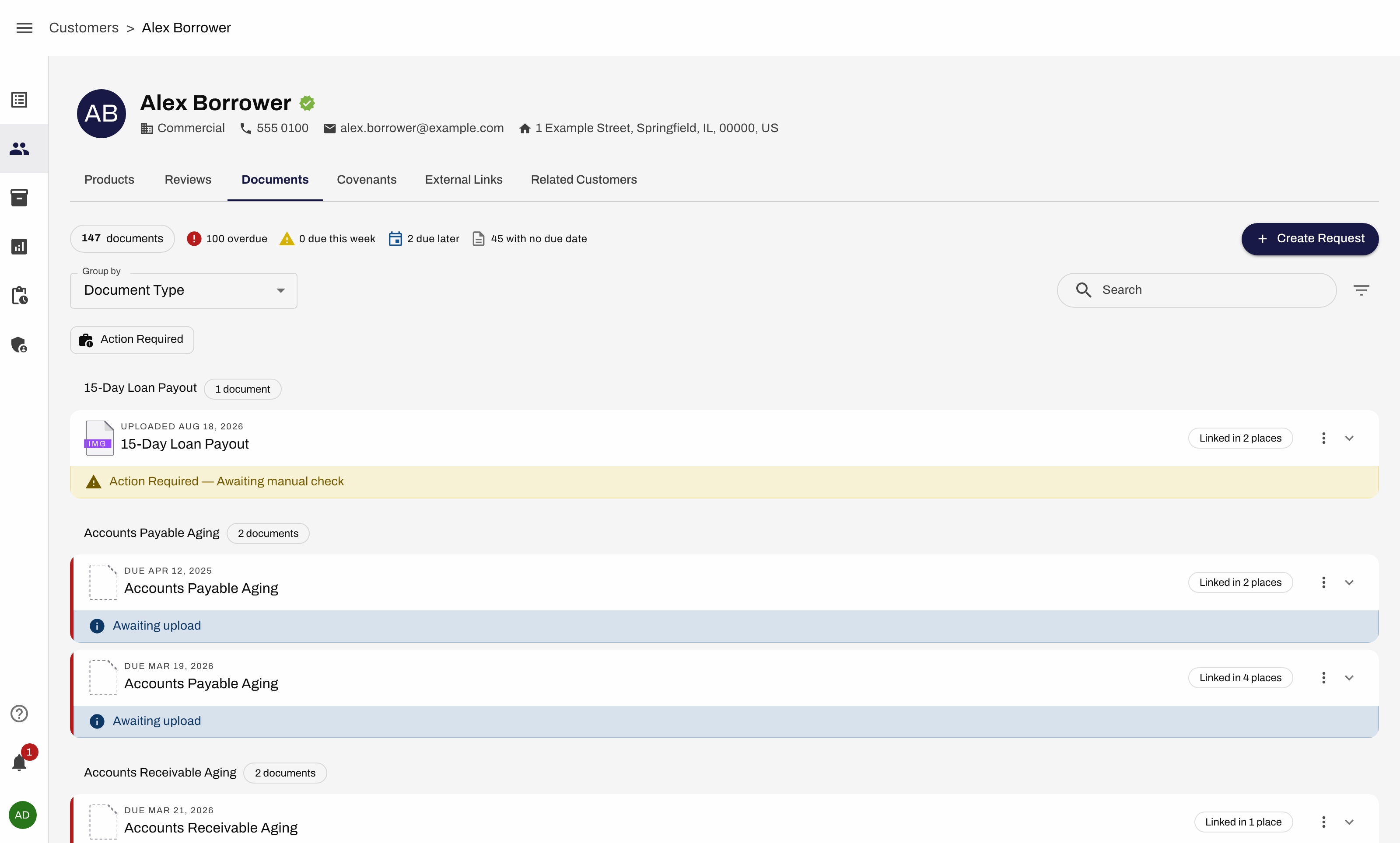
Request deduplication
The platform already merged duplicate requests behind the scenes, but nobody knew. Now every document shows a "Linked in N places" chip, and opening it reveals the linked context, the products and reviews it covers, plus a timeline of when it was requested, reminded and fulfilled. Staff can see one upload satisfies several needs, and that the borrower isn't being asked twice.
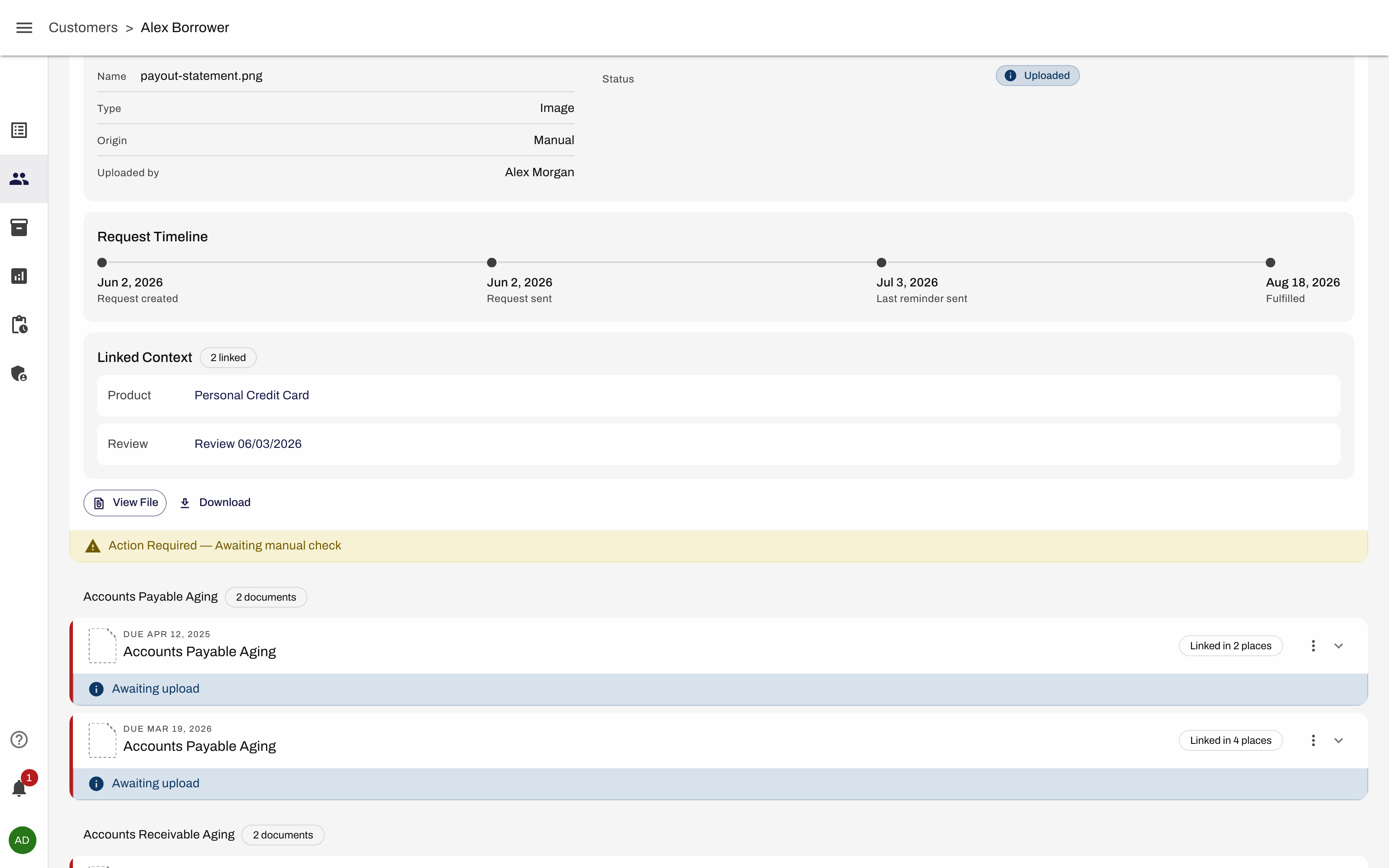
Next: request rejection
Cancelled requests used to disappear like throwaway items. I'm redesigning them as a back-and-forth between lender and borrower, so the history of a document stays visible.
For each one I designed the experience, then built the UI and front end with Claude Code on our design system. A developer built the back end.
Principles we confirmed
The sessions also settled design questions. The client confirmed that covenant changes should always apply to every future review; there's no real case for editing just one. Much of the old interface assumed the opposite, so this simplified future designs.
We also found features staff didn't know existed, which pointed to onboarding and documentation gaps, not just UI ones.
Where it stands
Three of the roadmap's fixes are built and the fourth is in progress. The bigger structural changes, and aligning review dates with the client's systems, are next and depend on decisions with the client. It's too early for hard numbers, so I'm not claiming any yet.
What I learned
Watching people work tells you things a feature request never will. The client asked for date fixes, but underneath was a mismatch in how they think about their work. Designing around their mental model, member first and documents first, mattered more than any single screen.