Taking a desktop-only platform mobile
Our lending platform was designed for desktop. Lenders work at desks, but their borrowers live on their phones. I'm making it work on mobile, borrowers first, by building responsiveness into every component as I migrate the app.
- Role
- Design and front-end build
- Team
- Design system and product engineers
- Timeline
- February 2026 – present
- Tools
- Claude Code, design system, Storybook
Outcome95% of borrower pages and 85% of lender pages now have responsive layouts. The only gaps left on the lender side are admin setup screens used once, at a desk. I wrote 77% of the mobile work.
The problem
Almost everyone uses their phone first now. Our customers, the lenders, mostly work on desktop, but their members, the borrowers, don't. They were filling in loan applications and uploading documents on screens the product was never designed for.
Results so far
The approach: build it into the system
Rather than redesign pages one by one for mobile, I made responsiveness part of the design system from its first component in February 2026. As I redesign each component during the migration, I make it responsive, so a migrated screen usually works on a phone with only small adjustments.
Today 53 of the 119 components have mobile-specific behaviour, and 45 of the 146 Storybook files test a mobile view. A written team rule backs it up: every UI change must work on mobile, horizontal layouts stack on small screens by default, and breakpoints come from the theme, never hard-coded widths.
Key patterns
Touch targets by default
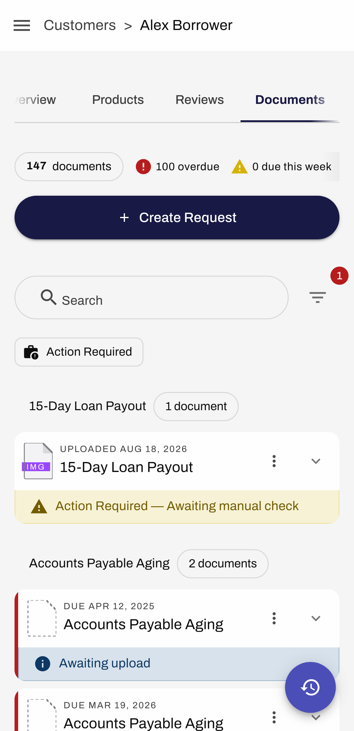
Buttons, checkboxes, switches, chips and links grow to a 48px minimum target on small screens. It's on by default, so accessibility on mobile doesn't depend on anyone remembering to turn it on.
Tables that stop being tables
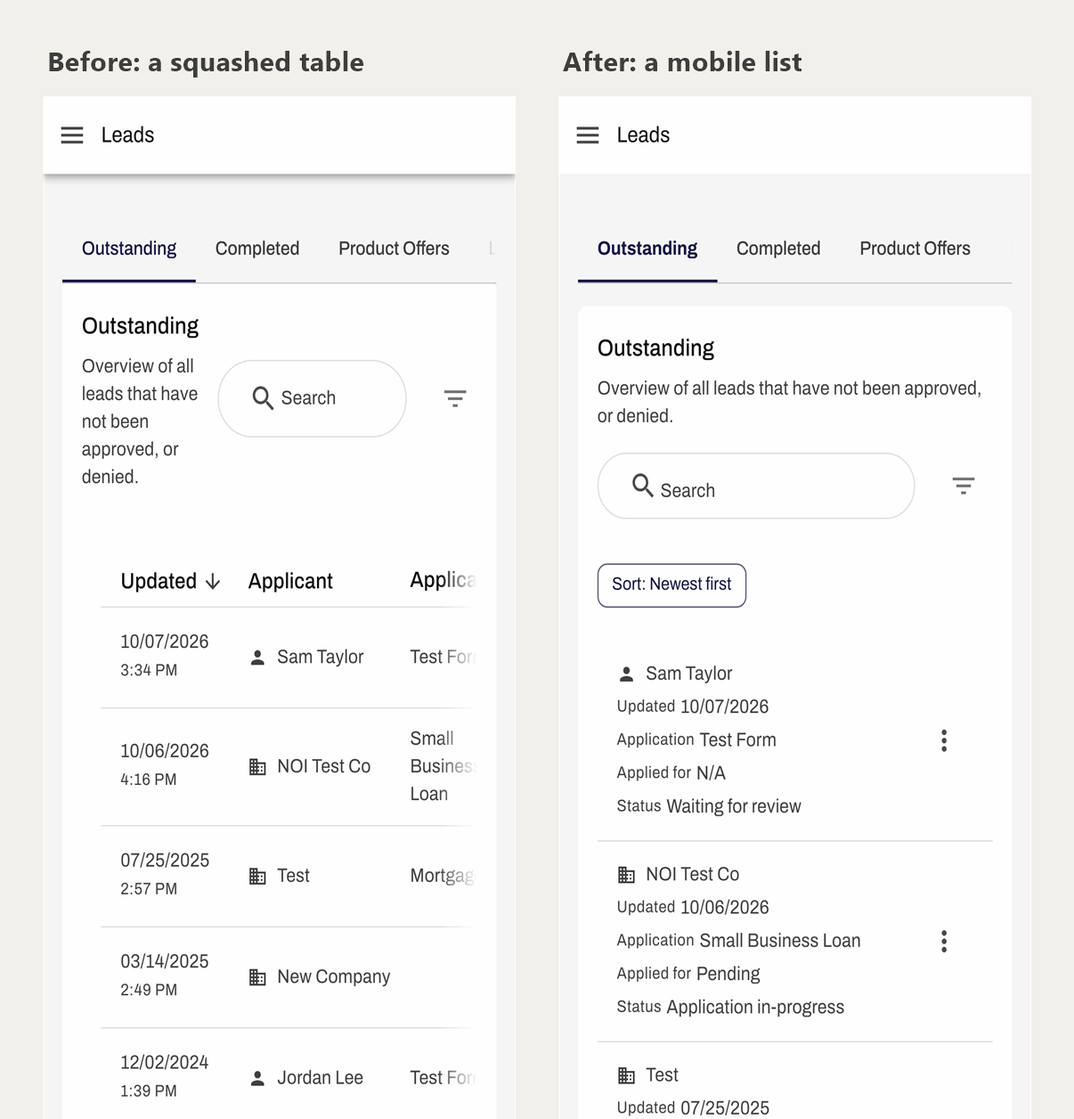
Data tables don't work on a phone. Seven purpose-built mobile lists replace tables below the breakpoint, for leads, requests, users, invites and reporting, and more components switch a table for a list or restack a row.
Overlays become bottom sheets
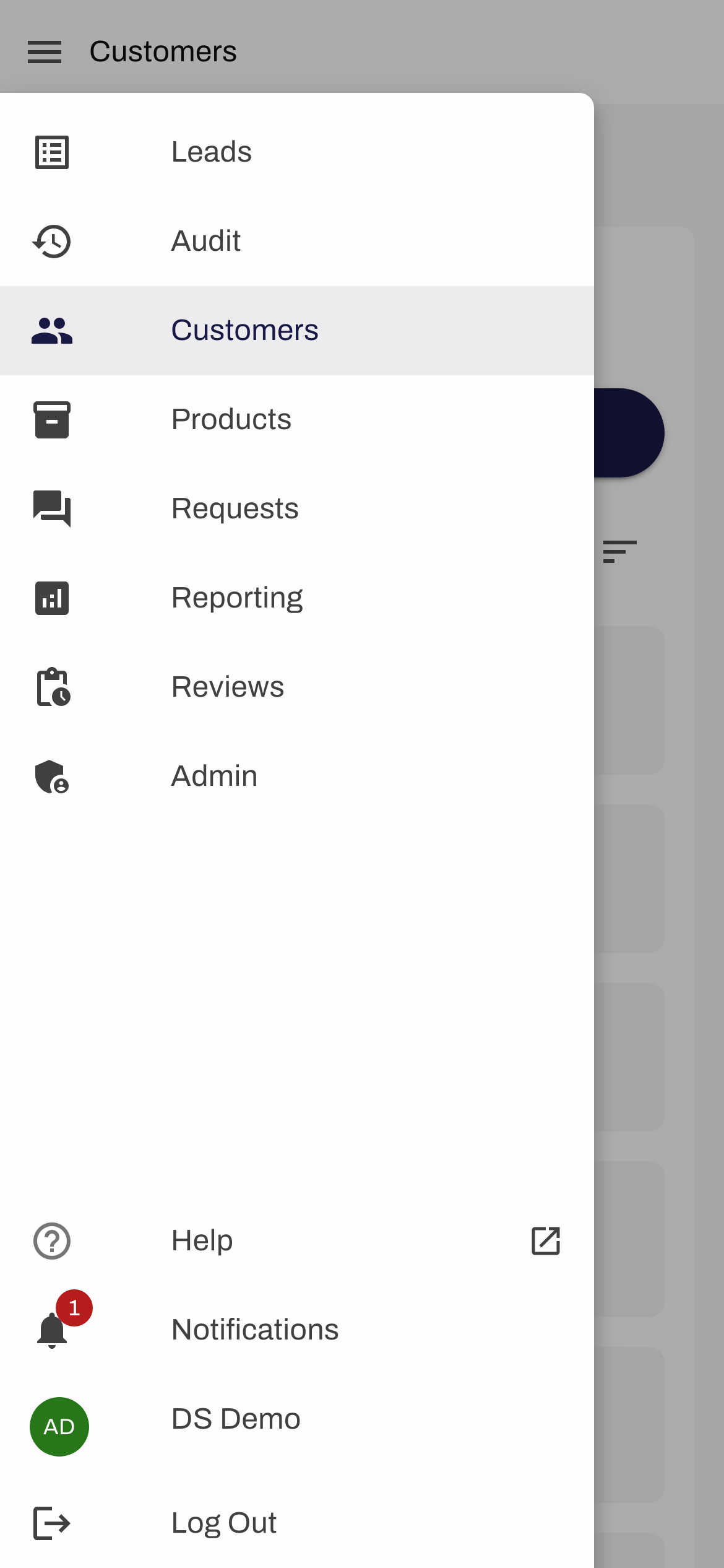
Dialogs and modals become bottom sheets on small screens, with the primary action placed where a thumb can reach it. Navigation drawers keep a strip of the page visible, so tapping outside still closes them.
Long flows that stay readable
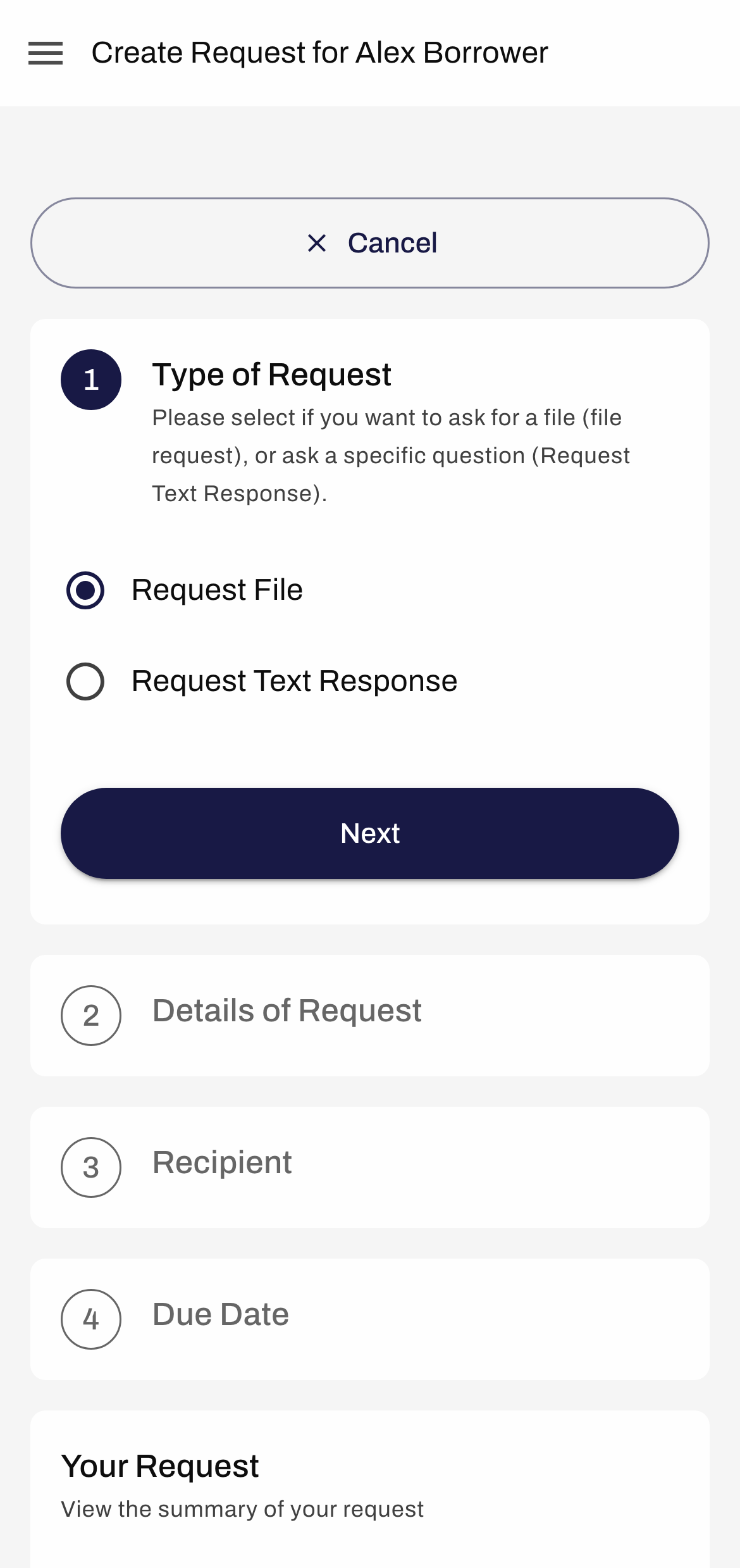
Multi-step forms collapse their progress dots into "Step 2 of 5", section actions stack under their titles instead of being squashed beside them, and timelines turn vertical.
Borrowers first
Borrowers were the priority because they're the ones on phones. 19 of 20 borrower pages are now responsive, including the biggest: the loan application form, document uploads and requests.
- 16 explicit mobile layouts
- 3 responsive layout only
- 1 desktop only
On the lender side, every remaining desktop-only page is an admin configuration editor, used once at a desk to set up products and forms. None of the day-to-day lender work is in the gap.
What I learned
Mobile works best as a property of the system, not a project. Building it into components meant the migration delivered mobile for free, and it kept going as other engineers built new screens on the same parts.