Redesigning a heritage venue's website, two ways
A charity-run Victorian hall was losing couples on their phones. I audited the site, then designed and built two clickable concepts, one led by weddings and one by the building, so its volunteer trustees could compare two directions.
- Role
- UX audit, concept design and front-end build (speculative pitch)
- Team
- Just me
- Timeline
- November 2026
- Tools
- Claude Code, HTML, CSS and JavaScript, headless Chrome, axe-core
OutcomeA 22-finding audit, two working concepts that pass automated WCAG 2.2 AA checks with no axe violations, redesigned brochures and a handover plan. Pitched to the trustees; their decision is pending.
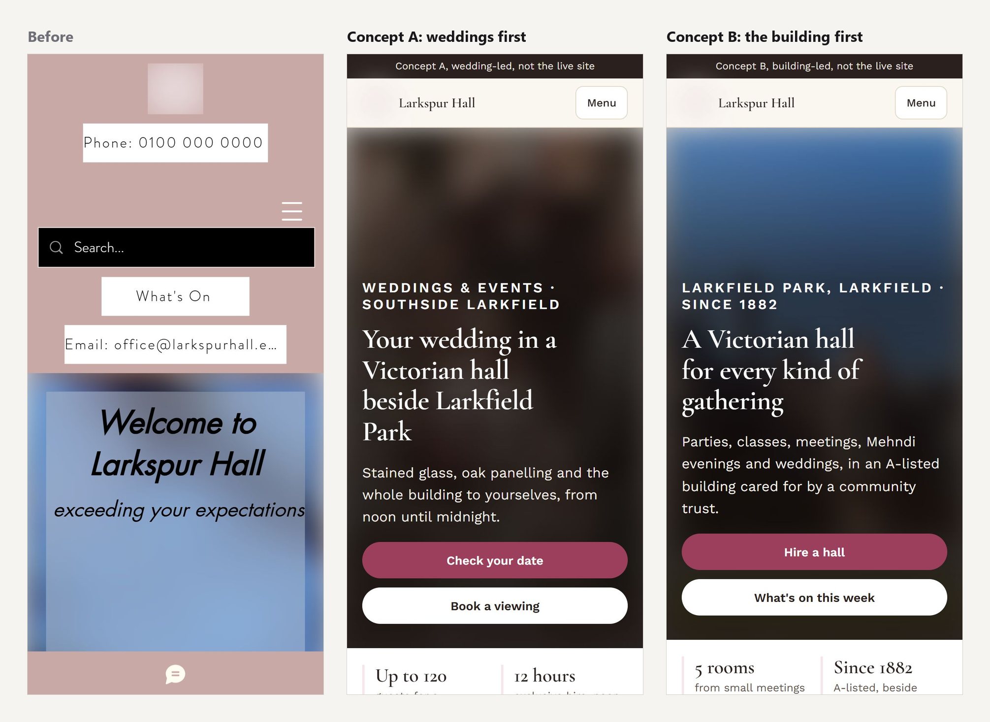
The problem
The venue is a listed Victorian hall run by a community trust. It hosts weddings, parties, classes, meetings, memorials and filming, and its volunteer trustees meet only a few times a year.
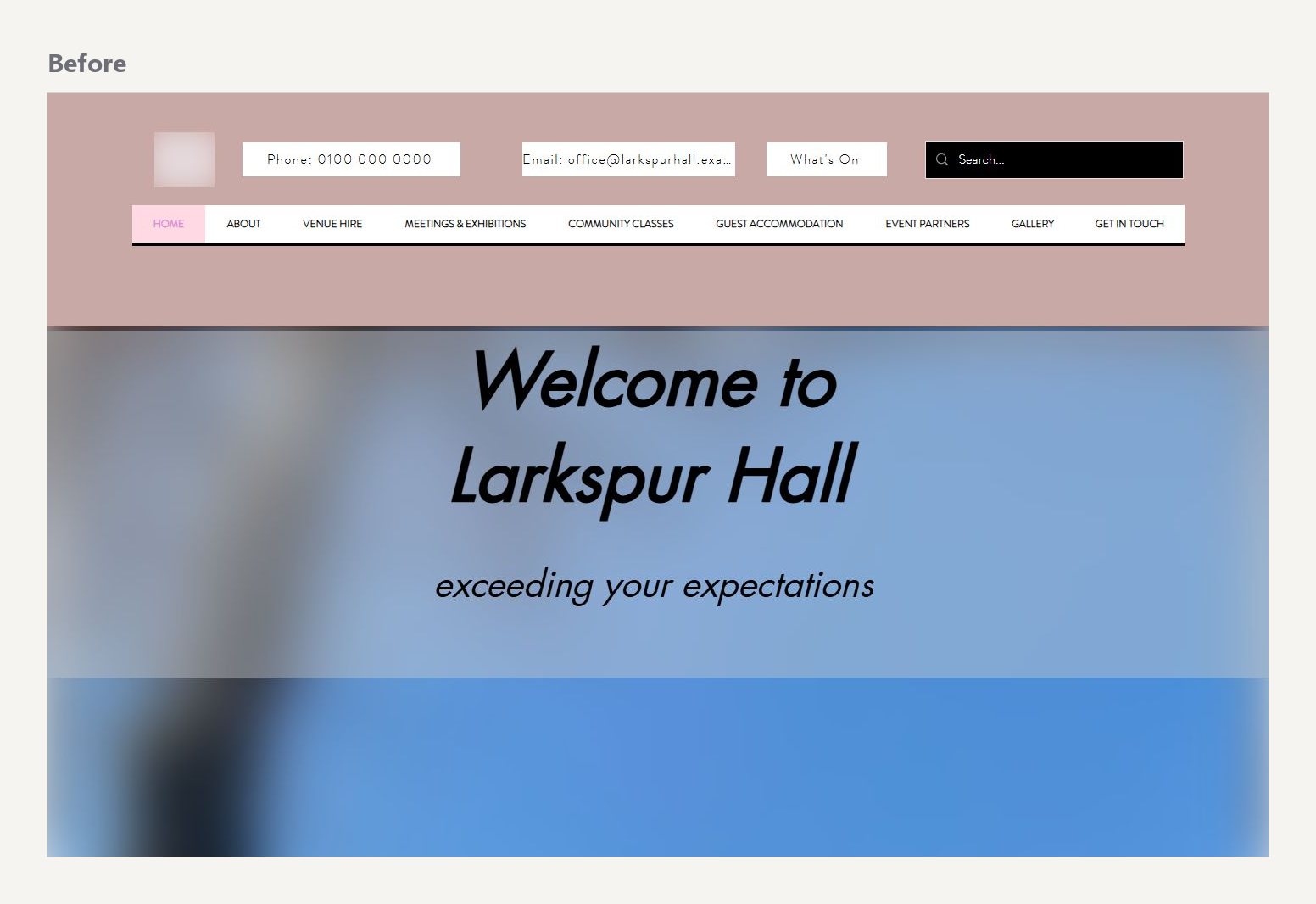
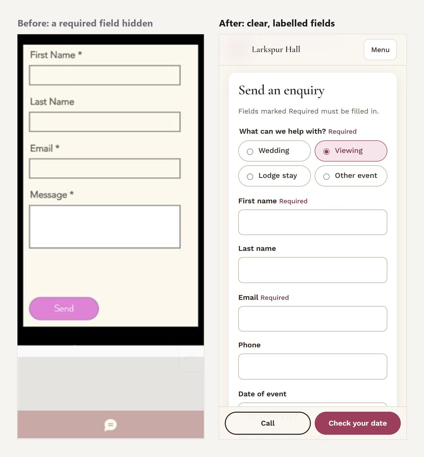
Its website looked fine on a computer. On a phone, where most couples first find a venue, the homepage was about five screens of blurred panel before any content, and the enquiry form hid a required field behind a map. There was no "Check your date" or "Book a viewing" button anywhere, so the most important question, "Is our date free?", meant downloading a PDF.
I offered the trust a no-obligation redesign concept, with nothing changed on its live site until it said yes.
How I worked
- Audit. I crawled all 44 pages and the three brochures, then tested the journey a couple takes by hand on a phone and a computer: find out whether our date is free, what it costs, and how to get in touch. I logged 22 findings, each tagged as a bug, a quick win or a decision for the trustees.
- Prototype in code, not pictures. Trustees aren't designers, so I built clickable concepts they could open on their own phones, using the venue's real photos, words and prices.
- Two directions. Weddings bring in the most money, but the building is a community asset. Rather than choose for them, I built both and let them compare.
- Check as I go. Every change ran through automated accessibility, layout and link checks in headless Chrome before I shared it.
Read the full audit (PDF, 17 pages, 5.5 MB, opens in a new tab). It's anonymised: the venue is renamed, and names, contact details and photos are changed or blurred.
Two directions
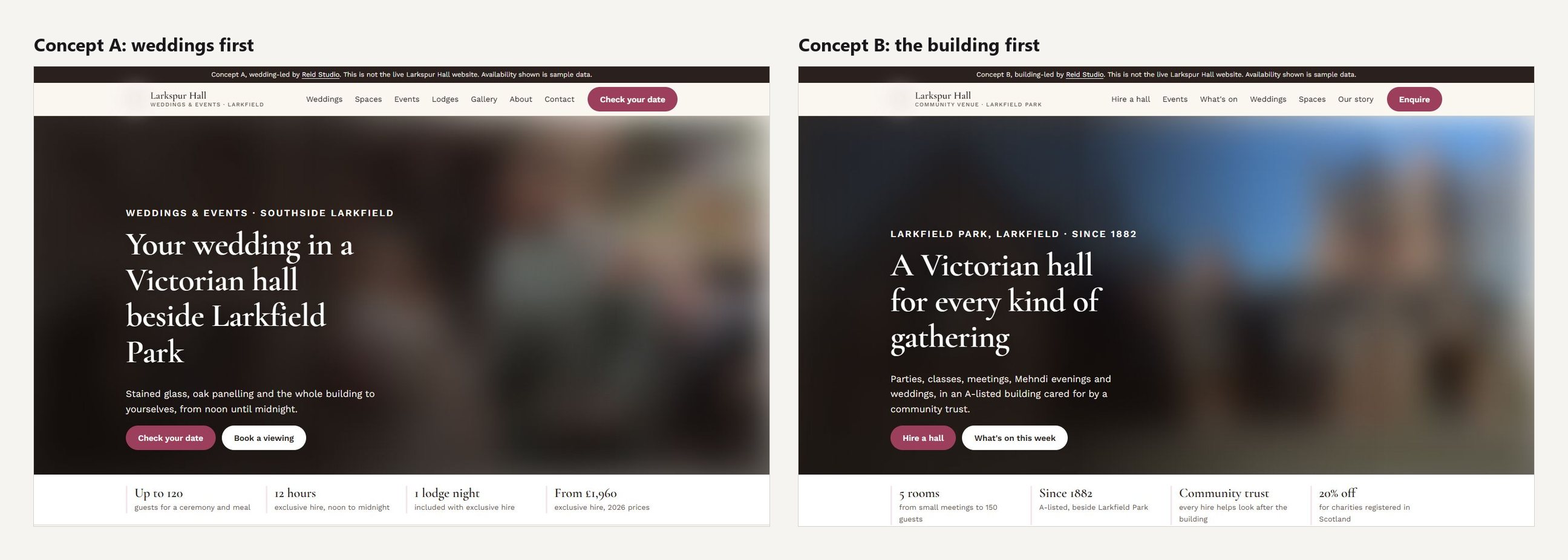
Concept A puts weddings first: a date checker, clear prices and one obvious next step on every page. Concept B leads with the building and every way to hire it, with weddings as one of several uses. Both share the same pages, components and fixes, so whichever the trustees pick, nothing in the audit is lost.
Key changes
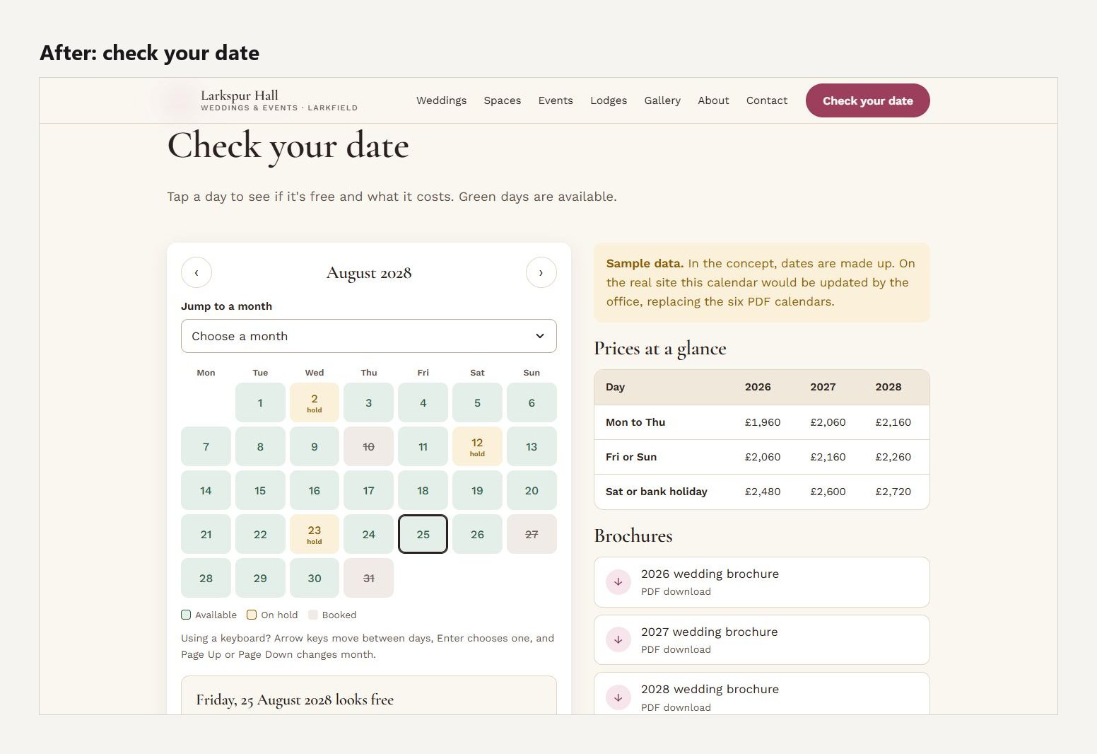
Answer "Is our date free?" in one tap
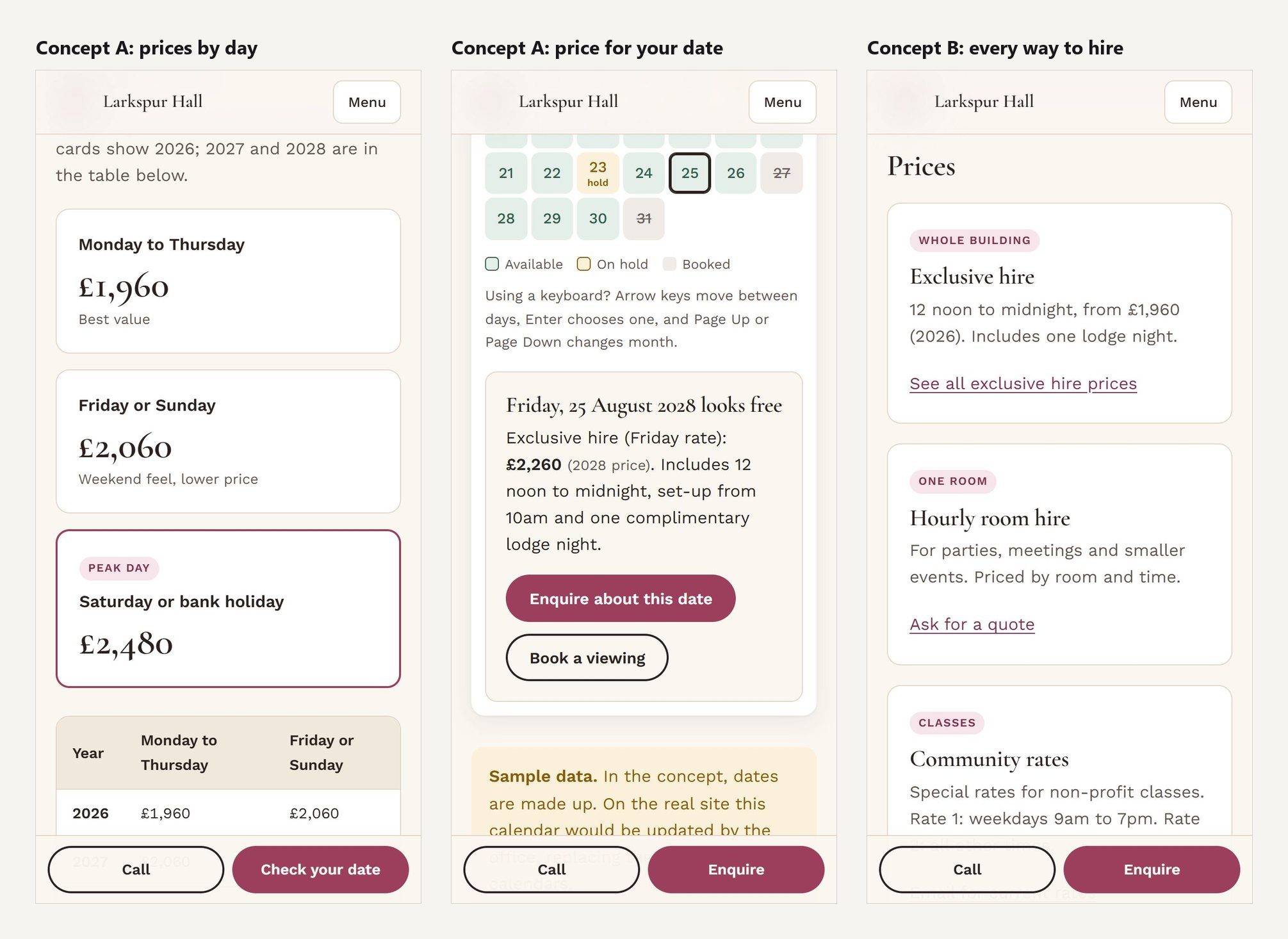
I replaced the PDF calendars with a date checker. Tap a day and it says whether it's free, what that day costs and what's included, with buttons to enquire about that date or book a viewing. It works with a keyboard and a screen reader as well as a finger.
Make prices easy to find and compare
The venue already published its prices, which builds trust, but they were hard to find and read. Now each day of the week is a card, with all three years in a table underneath, and the date checker shows the price for the day you pick.
An enquiry form that works on a phone
The new form asks what you need first, then shows only the fields that apply: wedding details for weddings, dates and guest numbers for a lodge stay. Errors are listed at the top and linked to each field.
Show everything beyond weddings
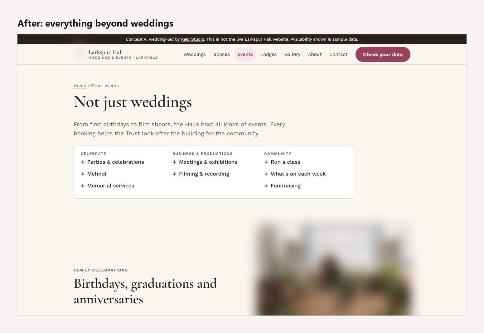
Parties, Mehndi evenings, classes, meetings, filming and memorials were buried in the menu. They now have one page, grouped by what people are planning, plus weekly classes and what's on.
Accessibility
Several pages on the current site fell short of WCAG 2.2 AA, mainly in text contrast, link names and a video that couldn't be paused. I built both concepts to meet it, and checked them on every page with axe-core plus my own tests for keyboard focus, focus hidden behind sticky bars, reflow at 320px, 200% zoom, tap-target size and reduced motion.
Beyond the website
The brochures were the last thing couples read before deciding, and their photos were only a few hundred pixels wide. I redesigned them to match the new site: one wedding brochure with every year's prices in one table, a short "Hire the Hall" brochure for everything else, and a guide to the venue's recommended suppliers. All three were watermarked as concepts.
I also wrote a build and handover plan, showing how the trust's own team could update prices, dates and suppliers without me, and how to move to the new site without breaking old links.
Pitching it
The trust is a charity, so I was careful about what I gave away before any agreement. The trustees received the two concepts, a pitch page comparing them with the current site, and a three-page summary of the audit's main findings. The full audit, the handover plan and print-ready brochures stay with me until we agree terms. I also passed on one free fix straight away: an email address on their site that would bounce.
What I learned
Building two concepts instead of one turned "Do you like it?" into "Which direction is right for you?" That's a much better question for a volunteer board. And because Claude Code let me prototype in real code, the trustees could judge the concepts on the device their customers actually use.